Nissan refreshes logo after 20 years

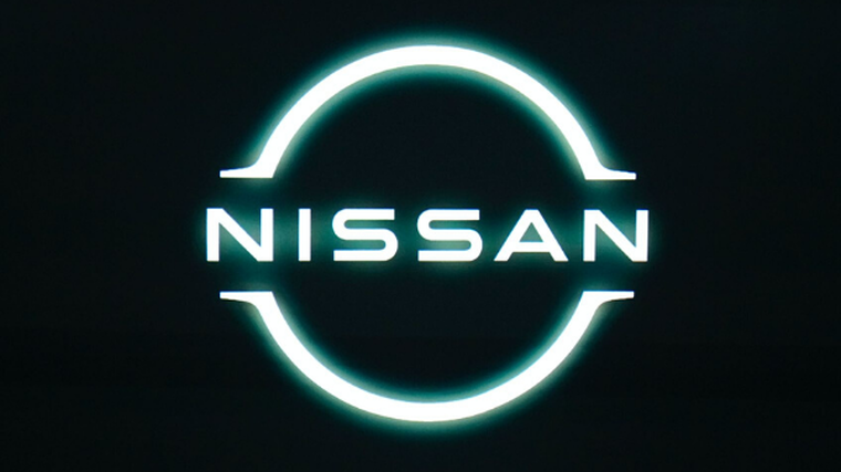
Nissan has revamped its logo for the first time in 20 years, claiming the sleeker design will reflect its next generation of high-tech vehicles.
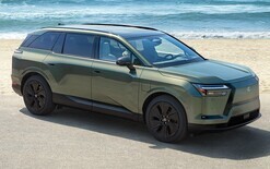
The new logo has made its debut on the marque’s first fully electric SUV, the Ariya, which was also unveiled by the company on July 15.
Showrooms are set to switch to the new-look emblem over the next few years and it will appear on all new and updated models.
According to Nissan, “the overall effect of the redesign is a transition from a hard-edged, industrial feel to a refined, familiar and digital-friendly look”.
It adds the logo reflects “the significant changes in society over the last two decades” and is “a reimagination of the iconic Nissan brand logo for a new chapter”.
The company name remains at the centre of the design, which will be incorporated across all mediums from July, and it will be illuminated on all-electric models by 20 LEDs – to correspond to the number of years between logo changes.
Nissan says the company began work on updating the logo in 2017 when Alfonso Albaisa, senior vice-president of global design, set up a design team led by Tsutomu Matsuo, deputy general manager of Nissan’s advanced design department, to “study everything from a subtle evolution to a complete reinvention” and they came up with a motto of “thin, light and flexible”.
Makoto Uchida, chief executive, describes thew new look as “futuristic, while staying connected to the rich heritage of Nissan”.
.png)


