Audi launches updated logo

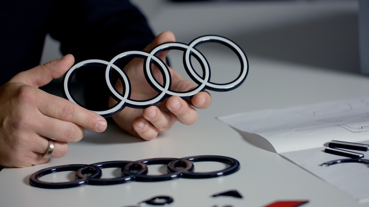
Audi has introduced a two-dimensional design of the four rings on the exterior of its vehicles and the Q8 e-tron will be the first models to sport the new corporate identity.
“The introduction of this is an exciting progression for the brand,” says Dean Sheed, general manager of Audi NZ.
“As a brand that stands for innovation and progress, we’re constantly evolving to ensure the highest level of quality and experiences for customers. This upgrade looks to make our iconic Audi rings even more unmistakable.”
The Q8 e-tron will boast the two-dimensional design of the four rings on its exterior, along with the model lettering and the marque’s logo on its B-pillar.
According to the company, Audi stands for “Vorsprung durch Technik”, for innovative mobility. It describes this as a “promise” that the four rings aim to reflect “through a progressive design”.
Obviously, the four rings are one of the marque’s most important identifiers. So why the change now, right on the vehicle itself? In this edited interview, designer Andre Georgi and brand strategist Frederik Kalisch explain what it all means…
Frederik Kalisch: Audi targets modern customers who value high-quality design and attention to detail. There are only two basic trends in brand presentation and product design today that precisely express premium quality – the loud and very bold, or the restrained, pure and clean.
Andre Georgi: The purist approach is more in-line with our philosophy. Strong brands win over customers primarily through their products’ underlying substance and discreet identifying elements. At Audi, this has always been the case and we’re now making it more consistent. Our philosophy is every detail must convey a meaning or serve a purpose. On the product, it is above all, our four rings. They are unmissable on the front and rear of every Audi.
Kalisch: Two-dimensional rings originated at Audi in 2016 due to digitalisation, essentially to depict the rings in a manner that suited the medium. Three-dimensionality on 2D displays wouldn’t have met our technical and aesthetic requirements. So, we opted for a 3D look. Our brand logo is highly graphic, which is an advantage, as it looks great in two dimensions.
Georgi: Our vehicle logo contains three components with a high-contrast black-and-white look. It’s as though the striking white floats are embedded in a black-glass body for greater radiance. By optically brightening the logo, the white lends the rings a flat, premium-quality look, which still appears 3D in detail.
Kalisch: In 2020, our team reworked the brand strategy and corporate identity. This led to our new vehicle-identification strategy, including the vision of 2D rings on vehicles. The updated scheme matches our new brand strategy, which means more sophistication.
Georgi: We’ve also standardised the fonts in and on the vehicle. In the future, our models will only use Audi’s unique font – known as “Audi Type”. The basic tone is significantly more restrained without compromising on distinctiveness or quality.


